
THE CHALLENGE
Context & Problem
The previous site was an unstable Wix build. It needed a credible, responsive presence for a premium insurance audience, and a foundation for the account experience.
SITE AND ACCOUNT
From the public site to the client record
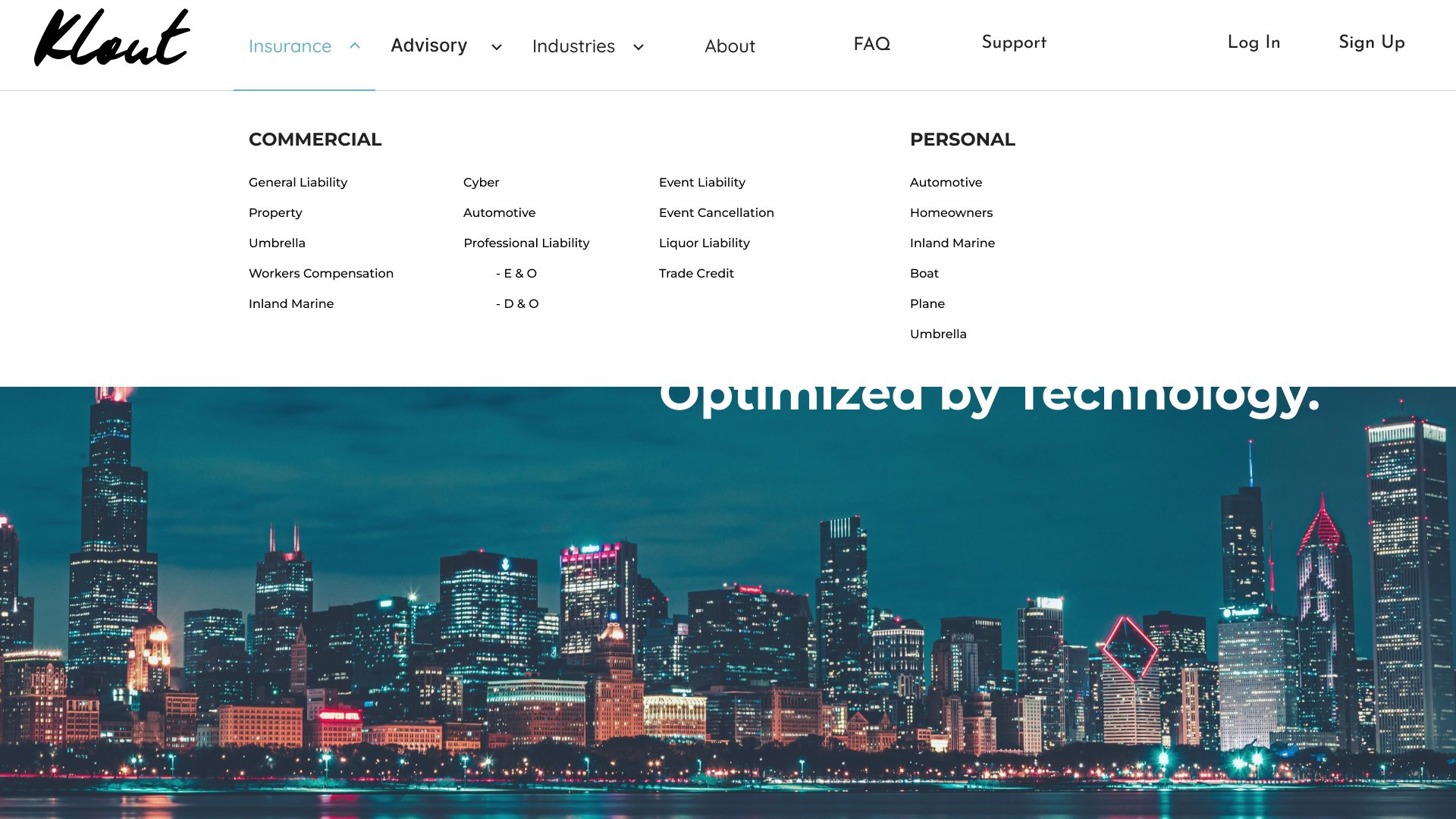
The public site leads with a path to quotes, then opens the offer through the insurance menu and policy explanations. Sign-in leads into a client record.
Insurance menu
Commercial and personal coverages sit in one menu, so the range of policies can be scanned without leaving the page.
INSURANCE MENU
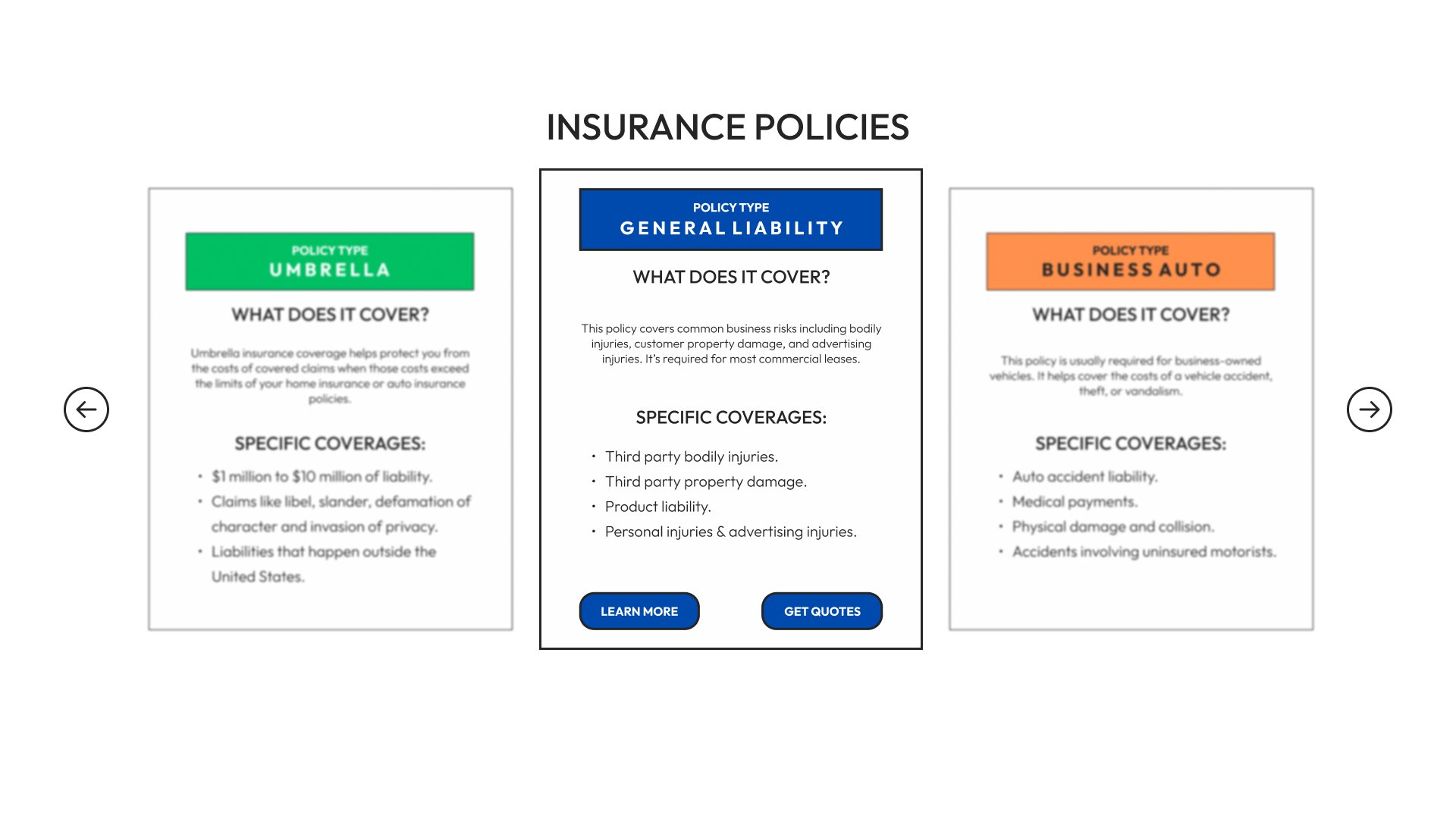
Policy explanations
Each policy card says what the coverage includes and offers a way to learn more or request quotes.
POLICY CARDS
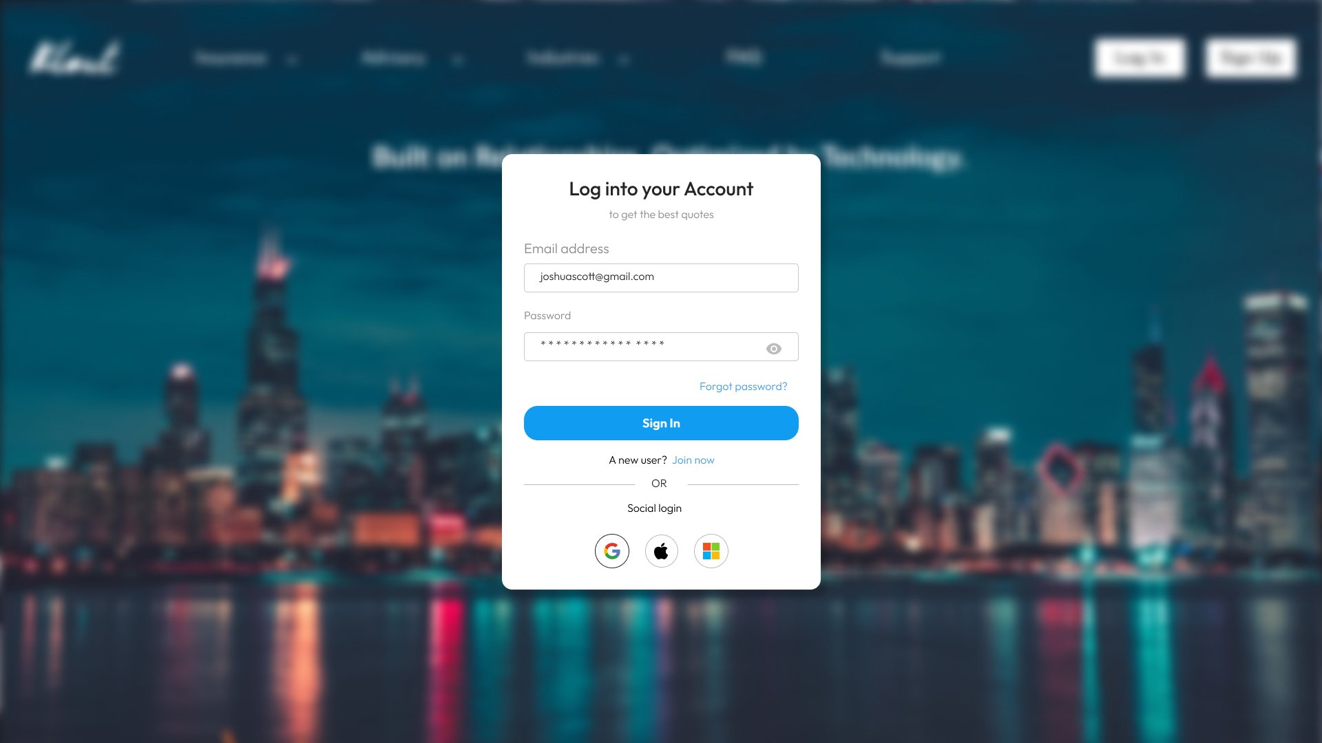
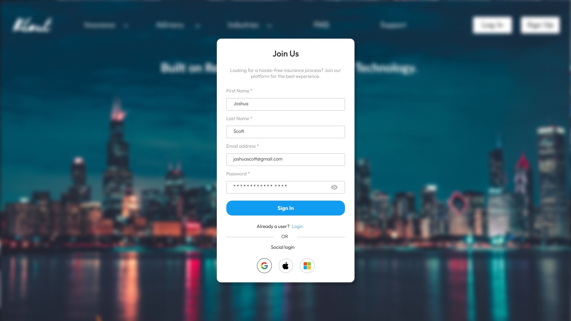
Account entry
Sign-in and sign-up use the same entry pattern, with a path from one to the other.
SIGN IN
SIGN UP
Client record
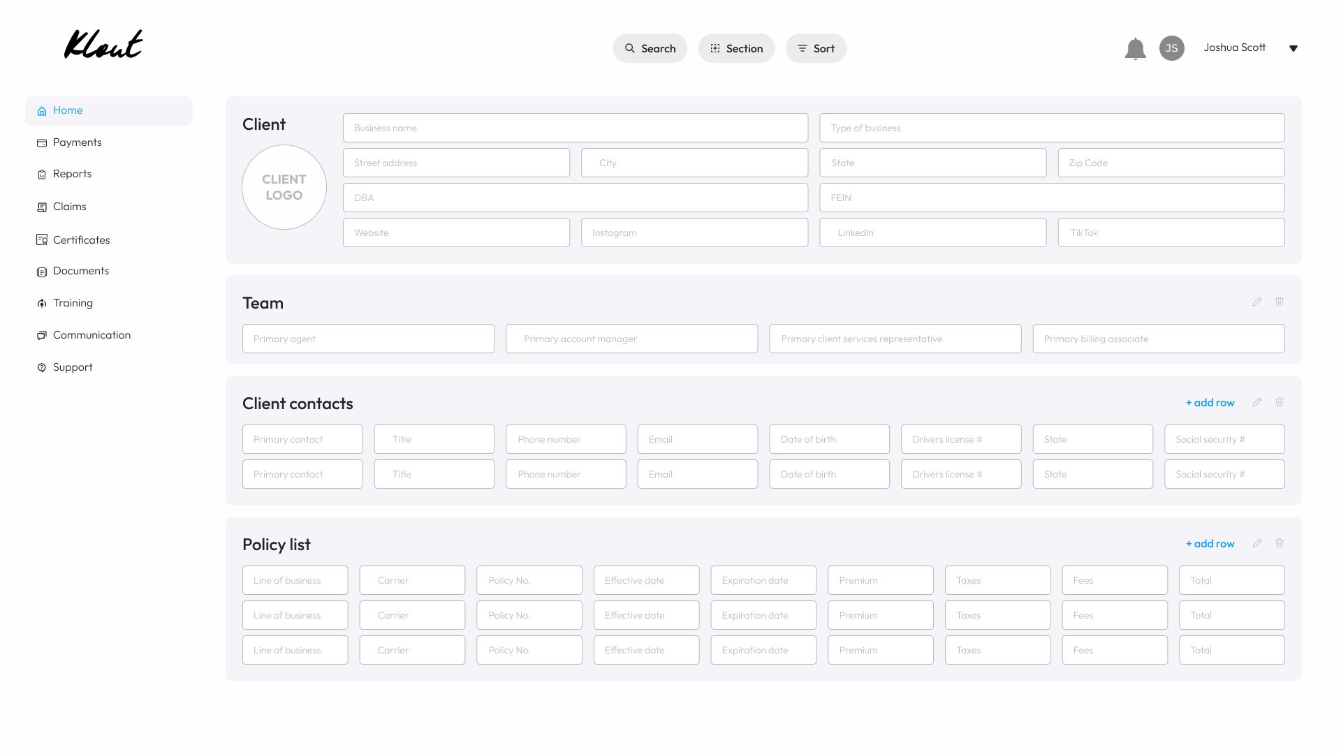
The account foundation keeps the client, team, contacts, and policy list in one record, with room to add rows.
CLIENT RECORD
MY CONTRIBUTION
Approach & Ownership
I was the solo UI/UX designer. I designed the marketing homepage, the insurance menu, policy explanations, sign-in and sign-up, and the client record for policies and contacts.
KEY DECISIONS
Strategic Choices
- 01
Lead the homepage with one line and a direct path to quotes.
- 02
Group commercial and personal coverages in the insurance menu so the offer is scannable.
- 03
Use one account-entry pattern for sign-in and sign-up, then keep the client, team, contacts, and policies in one record.
OUTCOME
Results & Evidence
A marketing site and the first account screens behind it. The client record is the foundation for keeping policies in one place. This page shows that design work. It is not a launch metric.
LEADERSHIP LENS
What This Demonstrates
Shows independent ownership of a public site and the account foundation that follows it.